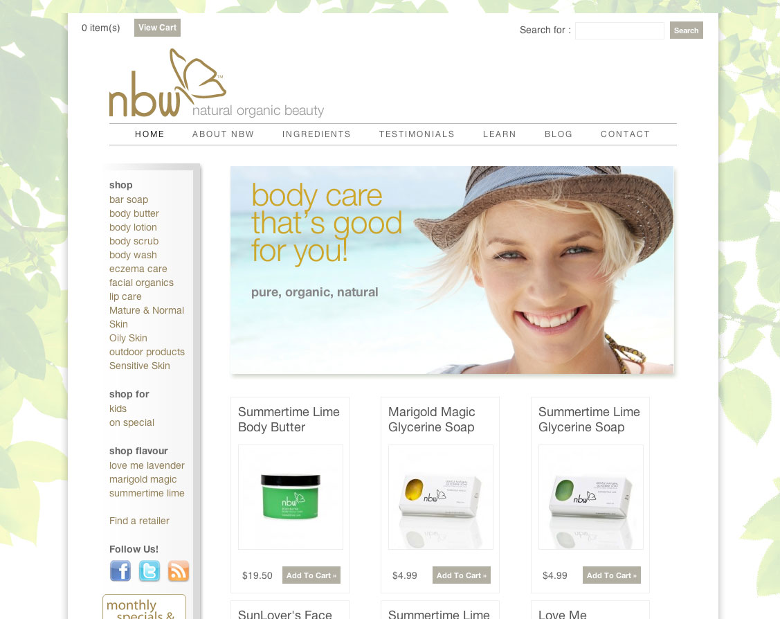
We were asked by Nature Balance Wellness to refresh their brand to help them stand out in the ever-growing natural skin care market.
Their competitors all took the same approach – soft colours, “olde time” style typography. We responded by taking their existing butterfly logo, simplifying it and using clean, clear typography to show the market that this is a brand that is looking forward and worth looking at.
After assessing the existing packaging and product line, we noticed a plethora of container sizes, types and label approaches. We knew we could help their bottom line by rationalizing the packaging while adding value to the brand at the same time.
Instead of using 8 different jars styles, we simplified the line to jars of two sizes both sharing a common lid. By eliminating all the other jar sizes we were able to economically add a small silk screen to the lid while saving costs overall.
White plastic bottoms and black lids for this natural product packaging design solution allows the use of multiple vendors and easily keep a consistent look for line into the future.


